In this post, we'll be covering the basics of fonts!
Of course, many of you probably already know what a font is--almost everyone does. But today, we'll be covering more than just the basic definition of a font! We'll be learning about all of the different types of fonts, different typography settings, how to pair fonts, and websites to turn to for great font resources and tools.
Sound cool?
Awesome! Let's get right on into this epic tutorial!
First, we should get you familiar with the main categories of fonts. The 4 main categories of fonts are:
- Serif
- Sans-serif
- Monospace
- Handwritten/script/display
I actually happen to have a presentation on fonts that I made for my 7th grade technology class, so I'll link a slightly modified version below:
That presentation should have given you a good overview of the huge, overarching topic that is fonts. However, there's still much to learn...
Serif fonts
You may have gathered this from the presentation, but it's worth repeating: a serif is a little line at the ends of a font's strokes. This diagram shows first a regular letter "F" types in a serif font, and then highlights the serifs in red:
Serif fonts are usually used in professional settings, like in resumes, letters and more serious websites. However, their uses are not just confined to the ones I just listed! They are highly legible, and can therefore be used under almost any circumstance!
Some of the most popular serif fonts are: Times New Roman, Cambria and Garamond.
Sans-serif fonts
A sans-serif font is a font without any serifs! As you may have learned from the presentation, "sans" means "without" in French, so a "sans-serif" literally means "without the serif." How cool is that?
Some of the most popular sans-serif fonts are: Arial, Verdana and Helvetica.
Monospace fonts
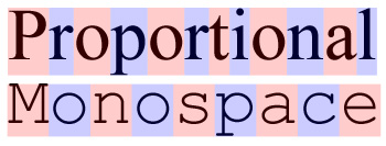
Monospace fonts are fonts that have the exact same amount of space in between each character.
In the above image, a regular (serif) font is compared to a monospace font. The serif font is what is called a proportional font, meaning that each of it's letters takes up a certain amount of space based on the width of the letter. For example, a lowercase letter "t" would take up less space than an uppercase letter "P" since the "t" takes up less horizontal room than the other letter. In a monospace font, however, each letter takes up the exact same amount of space.
Some of the most popular sans-serif fonts are: Consolas and Roboto.
Handwriting/display fonts
Display fonts include different subcategories of fonts like script/cursive fonts, handwriting fonts, and other miscellaneous types of fonts!
Fonts like Zapfino, Shadows Into Light Two, Tiki Island and Amatic are all examples of display fonts. You can look at the slide on display fonts in the presentation for some more examples!
Now that you know all about the different types of fonts, it's time to focus on a more important issue: how do you pair fonts?
It can be tricky to pair different fonts together at first, but before long, it usually becomes second nature. Here are some of my favorite font pairings of Google fonts:
Fonts from two different categories (ex: sans-serif and display) often work best together.
A few basic principles of pairing fonts include:
- The two fonts paired together cannot be too similar.
- It is best if the fonts paired are from two different categories.
- Pairing playful fonts with cleaner, more professional fonts is always a safe bet.
- Choose the most legible font (usually a sans-serif or serif font) for the body text, and the more playful/eye-catching font for the headings and titles.
And now, for some super-duper helpful resources!
DaFont: A great website for downloading fonts.
Google Fonts: Useful for pairing and searching for fonts.
Font Squirrel: Another website for downloading fonts.
FontPair: An ultra helpful site for pairing Google fonts of your choice!
There are, of course, many other resources that will definitely help you pick some nifty fonts for your next project, but the ones listed above are some of my favorites!
Additionally, there are several other smaller categories of fonts that I didn't mention here (like slab-serif), as to not confuse you if you are just learning about fonts. Terms like kerning, ligatures and hierarchy I didn't mention in this particular tutorial, but if you'd like to see a super-duper advanced version of this fonts tutorial, then make sure to leave your opinion down below in the comments!
Have a lovely day, and don't forget to smile!


Wowzie! Fonts are a lot more complex than I though!
ReplyDeleteAgreed! That's the point of learning though, and panda lays it out flat like its really simple. For me, only blogging for about 1 and a half year, this stuff is difficult! Though, I'm still learning and I'm glad panda has added this academy. Otherwise, I would've been in the corner crying out loud, "HOW ON EARTH DO I DO THIS. SOMEONE HELP ME PLEASE!!!"
Delete@Cookycupcake
DeleteYes! They definitely are super-duper complicated! I've tried my best to learn a lot about fonts in the past year or two, but there's still tons of stuff that I don't know! >.<
@Kylie
Aah, thank you! <3 I'm so happy that this academy has been helping you!